It started with one painting — a vintage market find I couldn’t leave behind. I imagined it hanging perfectly above my dining table, adding just the right touch of charm.
But once I got home and hung it, something felt off. Too high. Too small. Suddenly, the cozy dining room I’d pictured looked oddly unbalanced.
That’s when I fell down the rabbit hole of dining room art placement. I learned that it’s not just about what you hang, but how you hang it. The art should feel like part of the room, not floating awkwardly above it.
I experimented with grouping frames together, creating gallery walls, and even leaning oversized pieces against the wall for a more relaxed look.
After a few adjustments (and several measuring tapes later), I finally found what worked: art that’s centered at eye level, with the bottom edge around 6–10 inches above furniture like a buffet or sideboard. The space instantly felt cohesive — like the room finally had a heartbeat.
Now, my dining room feels personal, layered, and inviting. Each piece of art draws the eye, yet nothing overpowers the space.
It’s a reminder that perfect placement doesn’t just decorate a wall — it creates atmosphere, connection, and warmth every time you sit down to share a meal.
Contents
Golden Rules of Art Placement: Height and Proportion

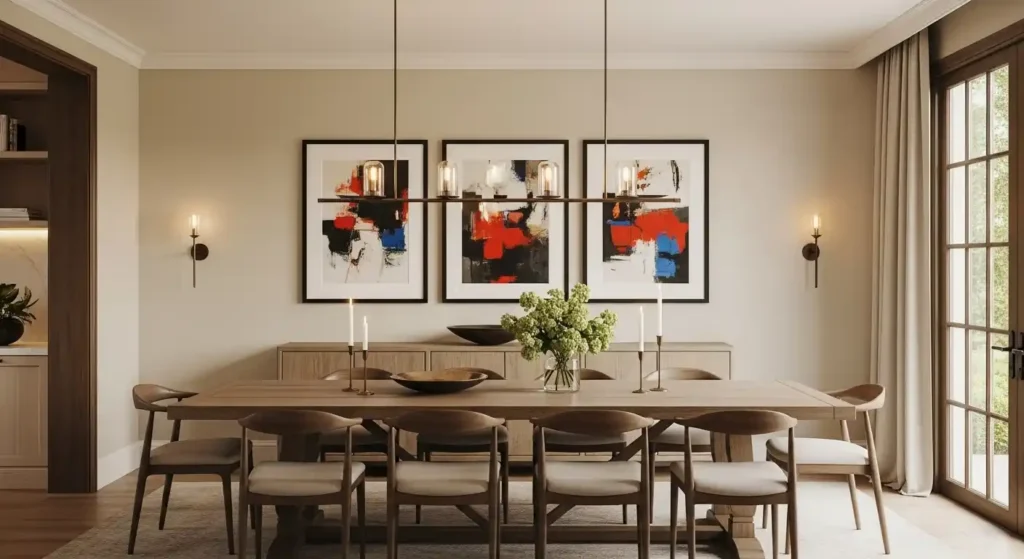
When hanging art, the primary goal is to display the piece so it is comfortably viewed by a seated person—a critical distinction for the dining room. Getting the height and scale right is the foundation of a professional-looking display.
1. The Ideal Hanging Height: A Seated View
Unlike a hallway or living room where the standing eye-level of 57–60 inches to the center of the art is standard, the dining room requires a subtle adjustment because most viewing happens from a chair.
- The Dining Room Sweet Spot: Aim for the center of the artwork (or the entire gallery wall grouping) to be approximately 48 to 54 inches from the floor. This range generally aligns with the eye level of a seated person, allowing for comfortable appreciation without having to crane one’s neck.
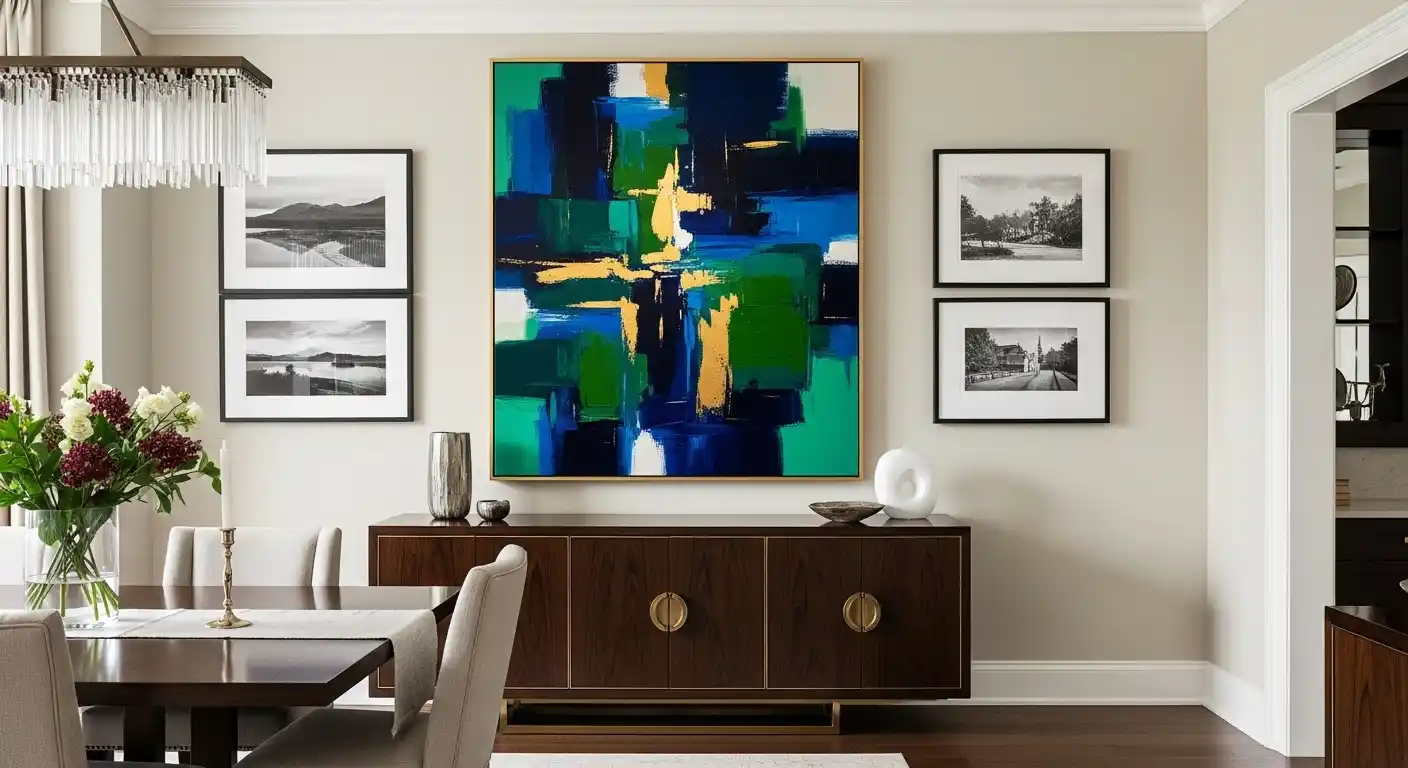
- The Furniture Rule: When hanging art above a piece of furniture, such as a buffet, sideboard, or console table, the bottom edge of the art should be hung 6 to 10 inches above the top of the furniture. This creates a visual connection, making the art and the furniture read as one cohesive unit rather than two separate, floating elements.
2. Mastering Proportion: The 2/3 Rule
The size of your art, or art grouping, should always be in proportion to the wall it’s on and the furniture below it.
- Over Furniture: The artwork should occupy roughly two-thirds (2/3) to three-quarters (3/4) of the width of the furniture piece it hangs above. For example, if your sideboard is 72 inches wide, your art or gallery grouping should span 48 to 54 inches in total width. This prevents the art from looking too small and lost, or too wide and overwhelming.
- Over the Dining Table: When hanging a piece directly over the table on a blank wall, the art should generally be slightly narrower than the table itself to maintain balance. As a practical note, ensure there is enough vertical space above the tabletop (at least 10–15cm/4–6 inches) to prevent guests from accidentally hitting the art while reaching or standing up.
Choosing Your Canvas: Statement vs. Gallery Wall
The scale of your room and the available wall space will dictate whether a single, dramatic Statement Piece or an engaging Gallery Wall is the better choice. Each has its own visual impact and set of considerations.
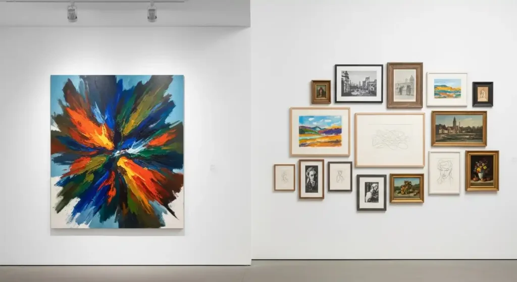
Comparison: Single Statement Piece vs. Gallery Wall
| Feature | Single Statement Piece | Gallery Wall |
| Visual Impact | Bold, dramatic, anchors the entire room. | Eclectic, personal, encourages lingering and storytelling. |
| Ideal Space | Large, open walls; areas needing a single, strong focal point. | Walls that feel too big for one piece; areas to showcase a collection. |
| Cost | Typically higher for a single, large-scale original or high-quality print. | Can be more budget-friendly by mixing prints, photos, and thrift finds. |
| Installation | Simple—one hook and one measurement (but requires precision). | Complex—requires extensive planning, templating, and precise spacing. |
| Flexibility | Low—the piece is the focal point; changing it is a major update. | High—easy to swap out individual pieces to change the mood or theme. |
Pros and Cons
| Approach | Pros | Cons |
| Statement Art | * Uncluttered: Provides a clean, sophisticated look. * Instant Focal Point: Immediately draws the eye and defines the space. * Simplified Selection: Only one piece to choose, frame, and hang. | * High Cost: Large, quality pieces can be very expensive. * Risk: If the one piece is wrong, the whole wall fails. * Dominance: Can overwhelm smaller or cozier rooms. |
| Gallery Wall | * Personal Storytelling: Allows you to showcase varied tastes, memories, and collections. * Scale Adjustability: Can be built out to fit any wall size perfectly. * Visual Interest: The mix of mediums, frames, and subjects sparks conversation. | * Visual Chaos: If poorly executed (inconsistent spacing, clashing styles), it can look messy. * Installation Time: Requires significant planning with paper templates. * Nail Holes: Risk of many visible holes if you adjust the layout. |
Setting the Mood: Art Style and Theme
The art you choose should complement the function of the dining room—a space for nourishment, conversation, and warmth. While you can, and should, choose art that you love, certain themes and styles inherently enhance the dining experience.
Recommended Art Themes for a Dining Room
- Still Life (Modern or Classic): Traditionally featuring food, fruit, or wine, these pieces reinforce the room’s function in an elegant way. A modern, abstract take on a still life is a sophisticated twist.
- Landscapes and Nature: Serene scenes create a calming, expansive feel that can counteract the close quarters of a dining setup. They also bring an element of the outdoors in.
- Abstract Art: Great for sparking conversation! Choose pieces with rich, non-literal colors that complement your decor and allow guests to interpret the work in their own way.
- Botanical and Floral Prints: These can inject a fresh, airy, and vibrant feel into the room, especially in a grid-like gallery wall formation.
Art Styles and Their Atmosphere
| Style | Aesthetic Impact | Best For Dining Room Vibes |
| Modern Abstract | Bold, dynamic, and clean. | Energized, contemporary, and conversation-starting. |
| Traditional/Classic | Elegant, refined, and established. | Formal, sophisticated, and timeless dinner parties. |
| Minimalist | Understated, clean lines, and neutral palette. | Calm, quiet luxury, and focused on texture/form over color. |
| Eclectic/Bohemian | Personal, collected, and warm. | Casual, intimate, and highly personalized gatherings. |
Pro Tip: Avoid overly graphic, intense, or disturbing imagery in the dining room. Your art should stimulate appetite and conversation, not suppress them.
Practical Placement Strategies and Lighting
The placement process doesn’t end with size and height. The final, high-value touches involve framing and, most importantly, lighting.
Framing and Matting
The right frame is the final presentation layer that links the art to the room’s decor.
- Consistency for Cohesion: In a gallery wall, a consistent element—such as all black frames, all natural wood frames, or all white matting—is crucial for making the collection look curated rather than random.
- The Matting Effect: Matting (the border between the art and the frame) provides “breathing room” for the artwork, making it look more formal and often larger. Use white or neutral matting to ensure the focus remains on the artwork.
- Frame to Style:
- Modern/Minimalist: Sleek, thin, metal, or simple black/white frames.
- Traditional: Ornate, gilded, or hefty dark wood frames.
- Transitional: Simple, medium-thickness wood or metal frames.
Power of Lighting
Proper lighting is what transforms a nice piece of art into a genuine focal point. A piece of art that is unlit is essentially invisible at night.
- Picture Lights: The most classic choice. A small, dedicated LED light installed directly above the frame highlights the texture and color of the piece. Choose a light with a warm color temperature (2700K to 3000K) to enhance the warmth of the dining area.
- Accent Track Lighting/Recessed Spotlights: If your dining room has track lighting or recessed fixtures, angle one or two adjustable spotlights to directly illuminate the art from the ceiling. This is an excellent way to create a dramatic, gallery-like effect.
- Dimmers: Always put your art lighting on a dimmer. This allows you to adjust the intensity, creating a soft glow for an intimate dinner or a brighter spotlight for a formal gathering.
Creative Art Placement Beyond the Main Wall
Don’t limit art to the wall directly opposite or above the buffet. Think creatively about underutilized spaces:
- Diptychs and Triptychs: A single piece split into two (diptych) or three (triptych) panels works exceptionally well on long, narrow walls. The separation adds visual rhythm and creates an expansive feel.
- Mirrors as Art: A large, ornately framed mirror acts as both art and a functional tool, reflecting light from the chandelier and the dining table, making the room feel larger and brighter.
- Layered Art: In an open-plan space, you can casually lean a large, framed piece against the wall on a sideboard or buffet, and layer a smaller piece in front of it. This adds an effortless, high-end, editorial feel.
Installation Checklist: From Idea to Execution
To avoid the frustration of a “haphazard” or “too-high” hang, a professional process is essential.
- Measure Everything: Measure the wall width/height, the furniture width/height, and the art piece(s) size.
- Determine the Center: Based on the height rules (48–54 inches for a blank wall, or 6–10 inches above furniture), mark the desired center of your single piece or the overall grouping.
- Create Paper Templates (Gallery Walls): The single most important step for a gallery wall. Trace each piece onto paper (like craft paper or newspaper), cut out the templates, and label them.
- Tape and Arrange: Use painter’s tape to place the paper templates on the wall according to your planned layout. Use a level to ensure the top, bottom, or center lines of your grouping are perfectly straight. This lets you experiment with spacing without making any holes.
- Mark the Hardware Spot: Once the paper template is perfect, mark the spot for the nail or hook directly onto the paper where your hanging wire or D-ring lands.
- Hang and Level: Nail the hooks through the marked spot on the paper, tear away the templates, and hang your art. Use a mini-level on each frame to ensure a perfect horizontal alignment. Use museum putty on the bottom corners of light pieces to prevent them from shifting when doors close or people bump the table.
Conclusion: Art as the Dining Room’s Soul
The strategic placement of art in the dining room is one of the most effective ways to imbue the space with personality and polish.
By respecting the rules of proportion and height—adjusting for the seated viewer—and selecting art that enhances conversation and mood, you move beyond simple decoration.
Your art becomes the soul of the room, turning a simple meal into an enriched experience.
When done correctly, your dining room art placement will feel effortlessly sophisticated and truly high-value.